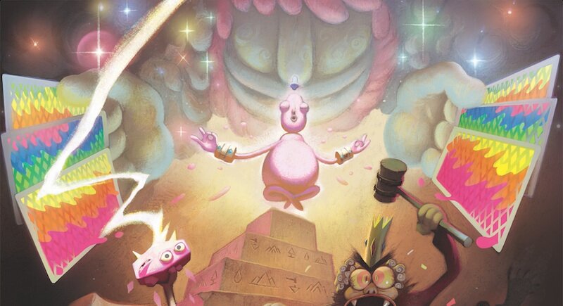
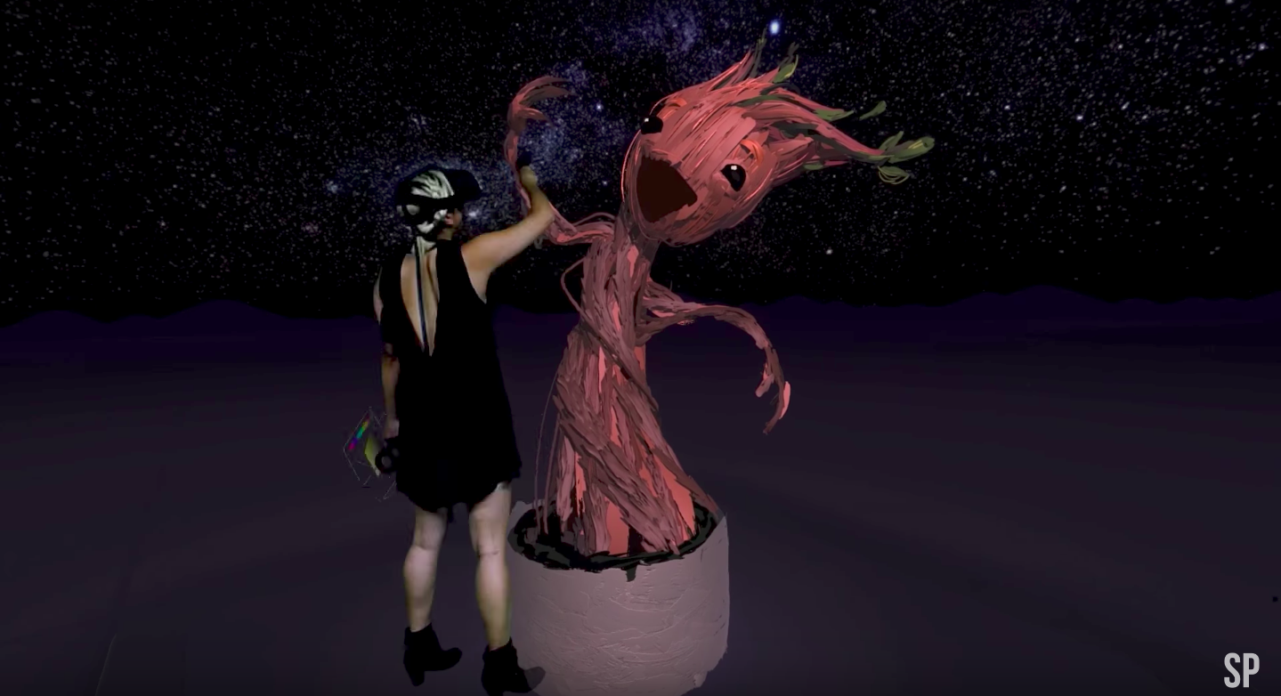
Cartoon Network Journeys VR
Two Sides of the Same Coin
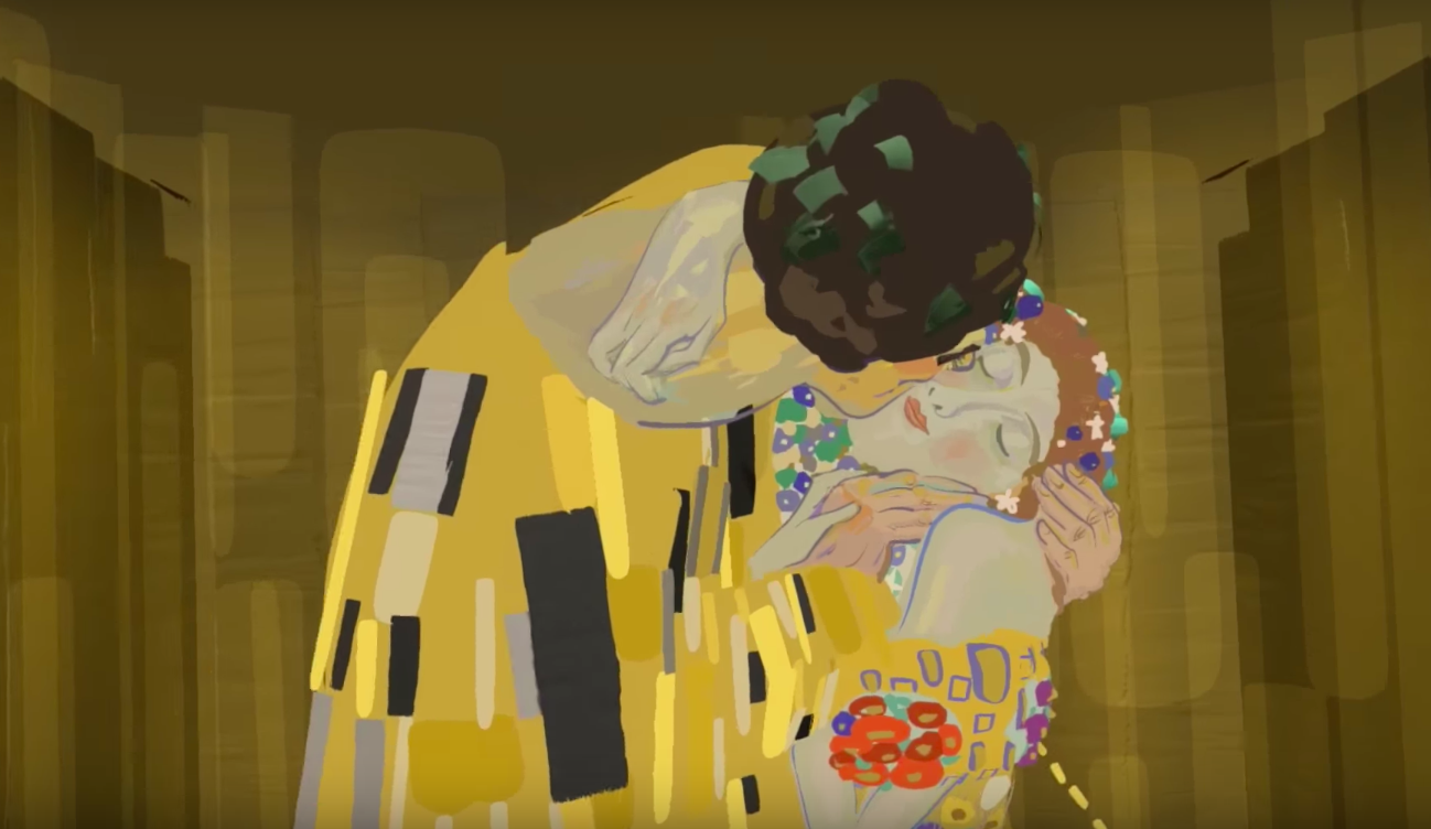
"The Kiss" by Gustav Klimt VR
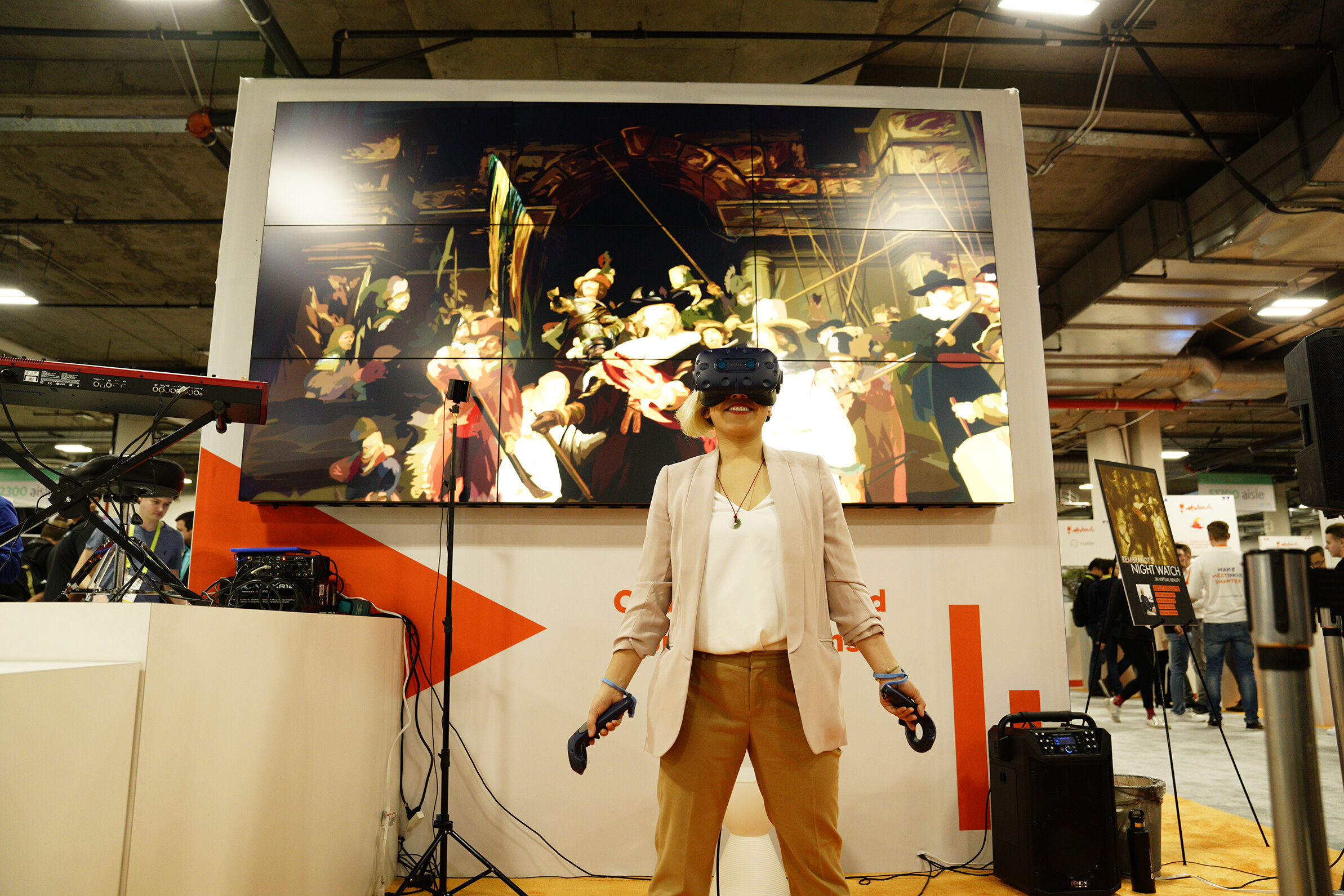
"The Night Watch" by Rembrandt in VR
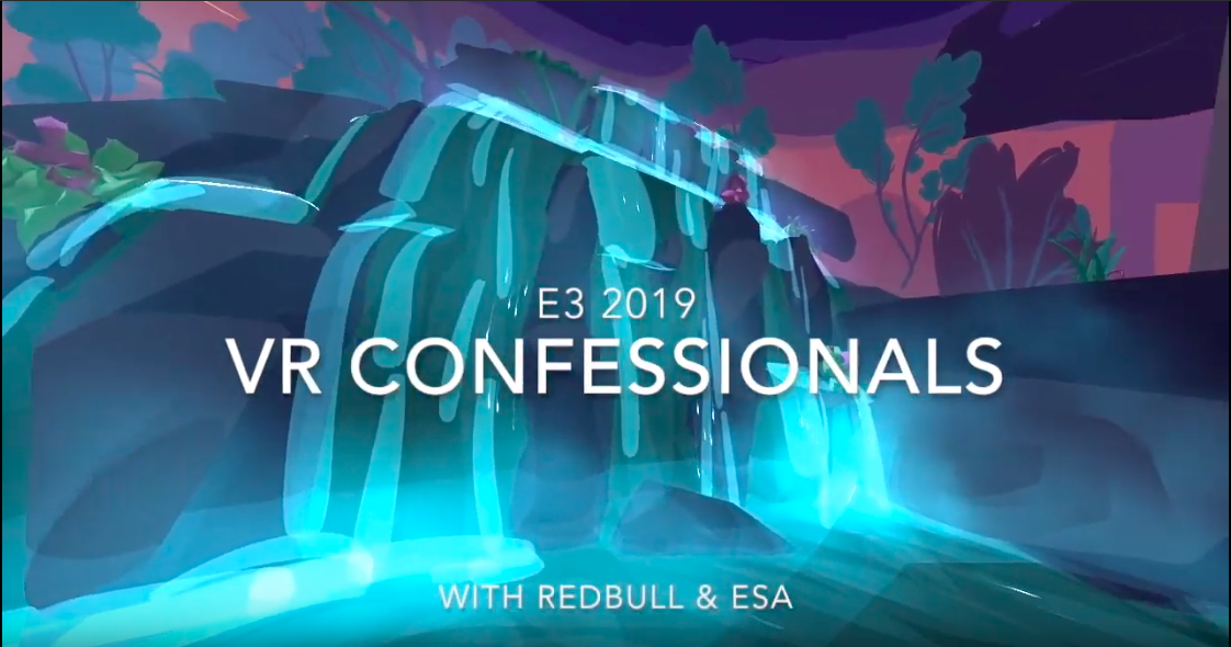
Redbull E3 VR Confessional
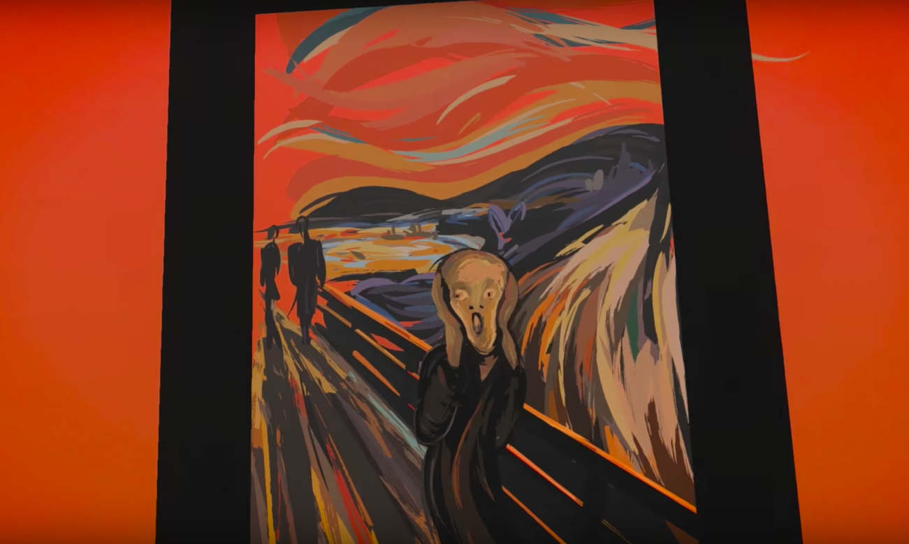
"The Scream" by Edvard Munch (VR)
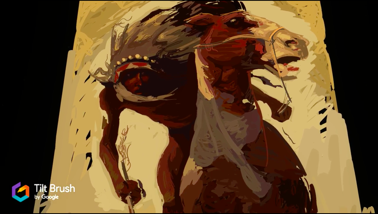
N.C. Wyeth's Indian Lance
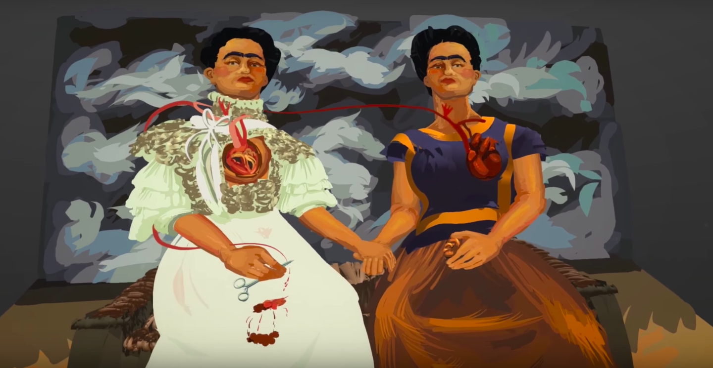
"The Two Fridas" by Frida Kahlo VR
"Vertigo" Film Study in VR
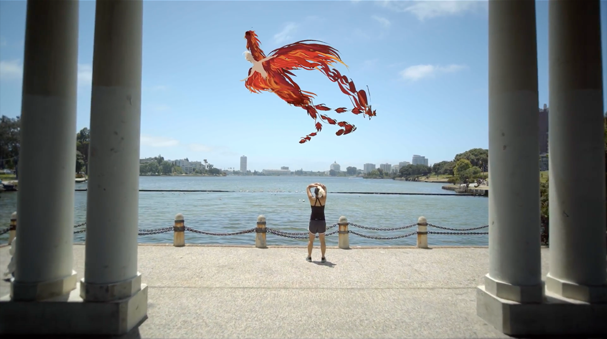
Lookin for Love in All the Wrong Places
Boston, Los Angeles, San Diego Triptych